What the data showed
I mapped the whole subscription funnel in Google Analytics. Three problems stacked on top of each other, and none of them were about product quality.
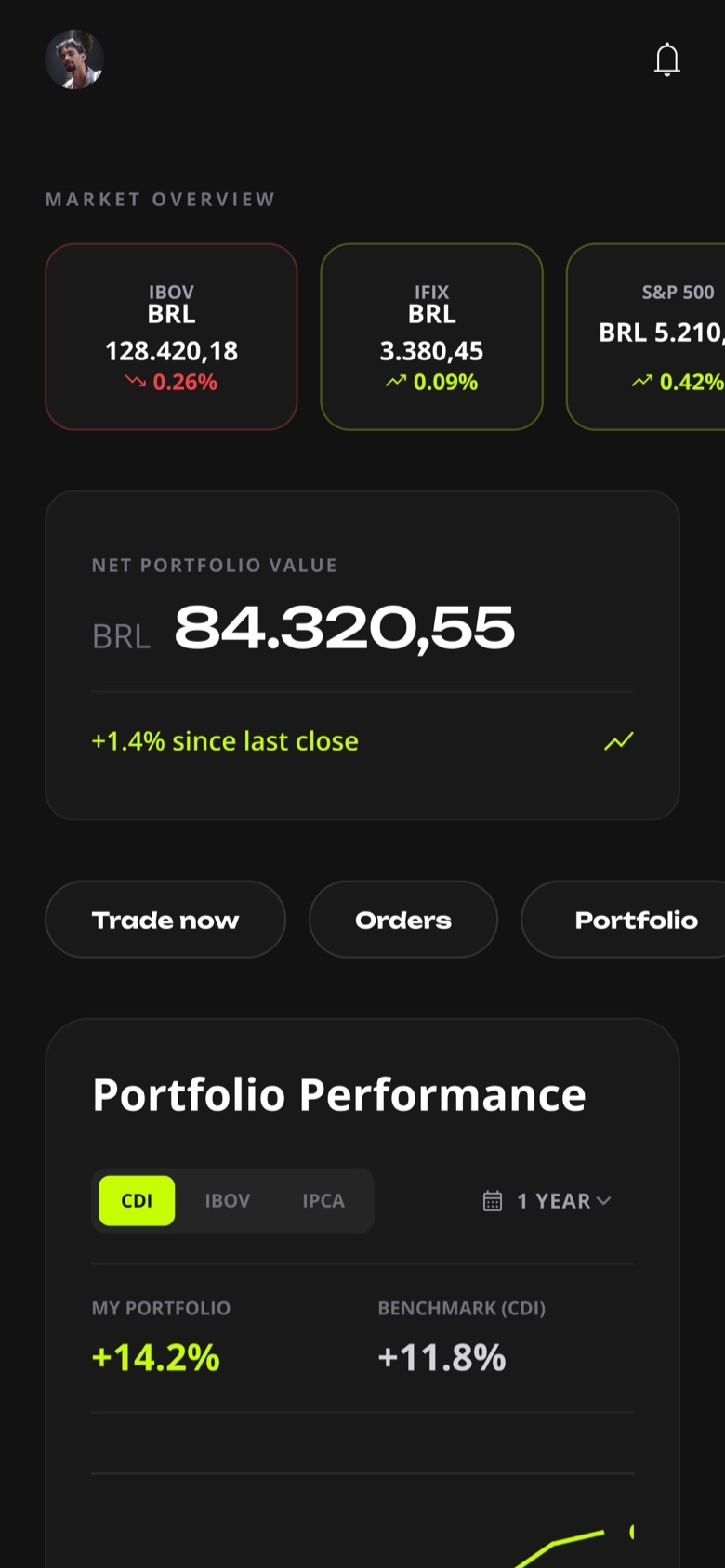
was the shortcut's spot in Variable Income, below six other options.
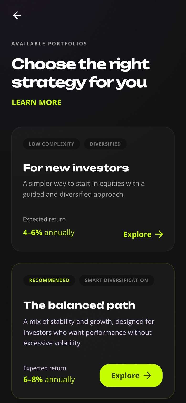
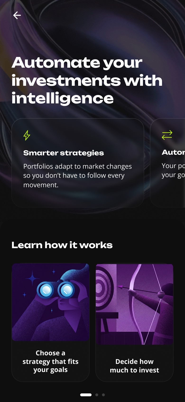
of people left on the landing page (LP) before seeing a single portfolio.
entry points where people researching stocks would meet the product.
Email campaigns had already brought traffic, and subscriptions barely moved. That confirmed the problem lived inside the app.
High perceived value combined with early drop-off pointed to timing. People met the product at the wrong moment.
Three interventions
Research already showed that people valued the product, so I left it as it was. Instead, I chose three changes that were fast to ship and easy to measure, each placed where people already meant to invest. Then I tracked every change weekly before adding the next one.
- 01
A trigger inside the stock picks
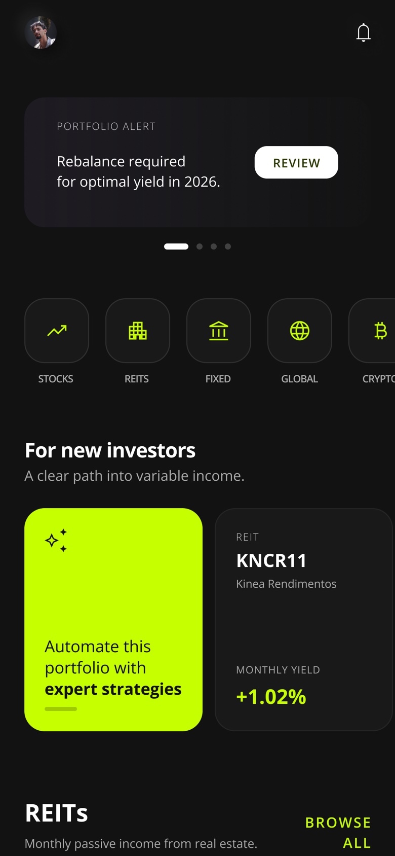
People browsing analysts' stock picks were already choosing what to invest in. So, with the Showcase squad, I added a card right after the picks that offers a portfolio built on the same research.
- Gave up
- Ownership. The card lived on another squad's screen, so I needed their buy-in.
- Got
- A spot where people were already choosing stocks.
+305%weekly subscriptions - 02
A Learn more link, no mandatory intro
Half of the people left on the intro page before they saw a single portfolio. So I moved its content behind a Learn more link on the portfolio screen.
- Gave up
- An intro that everyone saw first.
- Got
- People ready to decide go straight to the portfolios, and anyone who wants context still finds it.
+262%weekly subscriptions - 03
A better spot for the shortcut
The shortcut sat 7th in Variable Income, below six other options. However, that menu belonged to another squad, so I built a business case for them to move it to 3rd, with a deep link straight to the portfolios.
7xmore subscriptions from the shortcut
Kinea Rendimentos
Apple
Outcome
The app passed the web platform and specialist recommendations.
The other channels held steady, so the app brought in people who weren't subscribing before.
From August to September, as the three changes added up.
What I learned
Timing matters as much as the product. A strong product goes unnoticed when people meet it at the wrong moment, so I now treat discovery as a design decision.
Other squads own a lot of the outcome. None of the three changes were on screens my squad owned, so the business cases I wrote mattered as much as the layouts.
Where people are in their journey matters most. Moving the shortcut up helped, and the card in the stock picks helped much more, because people there were already choosing stocks.
Try the prototype
These are the screens I designed. Tap the highlighted areas to move through the flow, from the menu or from the showcase.